Redefining the online experience of vegan food delivery
The Problem
A digital platform that was undermining an industry-leading product
Vibrant Vegan delivers frozen vegan meals straight to your door. Having seen exceptional growth since their launch in 2018, the team were ready to scale the business and grow into the #1 frozen vegan brand in the UK.
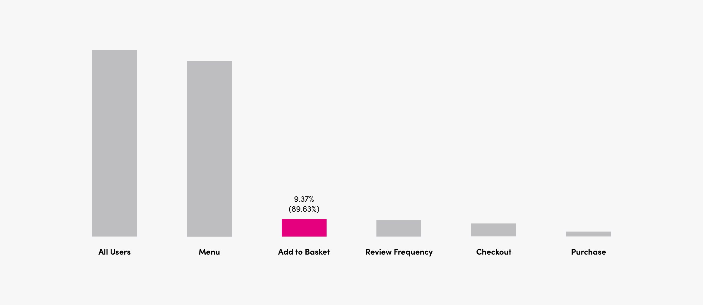
A key area holding the company back from this goal was the poor usability of their website, with nearly 90% of users dropping off after visiting the website’s Menu page.
Company
Vibrant Vegan
Role
Product design
User research
Tools
Sketch
InVision
Axure

The Goal
Improving new user conversion by redefining the user experience
With clear evidence backed by quantitative data that the core website funnel was seeing huge drop-offs, my goal was to figure out why this was happening and how we could make improvements through improved usability.
The Approach
Identifying the key problem areas through research
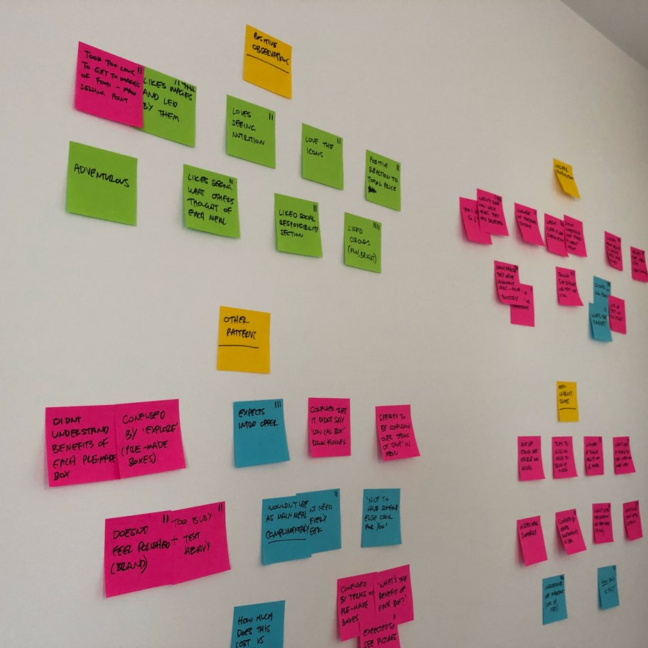
The first place to start was to speak with potential users and observe them using the current site. It was important that the research participants had never used Vibrant Vegan before, so we could understand how a new user would interact with the site.
The outcomes of the research were incredibly eye-opening. Many aspects of the proposition were found to be confusing, and the Menu page was riddled with usability issues. This gave me a solid set of problems to work towards solving, which I prioritised with the team.
“The majority of users did not know whether it was a subscription service or not.”
80% of users were unaware that boxes must consist of 6 meals.
Prototyping and testing proposed solutions
After providing initial wireframes for the team to review and agreeing upon a set of proposed solutions, I got to work building high-fidelity prototypes in InVision ready for evaluative testing.
I again performed a round of testing with participants unfamiliar with the website. The additional testing enabled us to refine our solution with confidence, as we were able to get qualitative feedback on both the micro and macro levels.
The Solution
A self-evident proposition that the user just gets
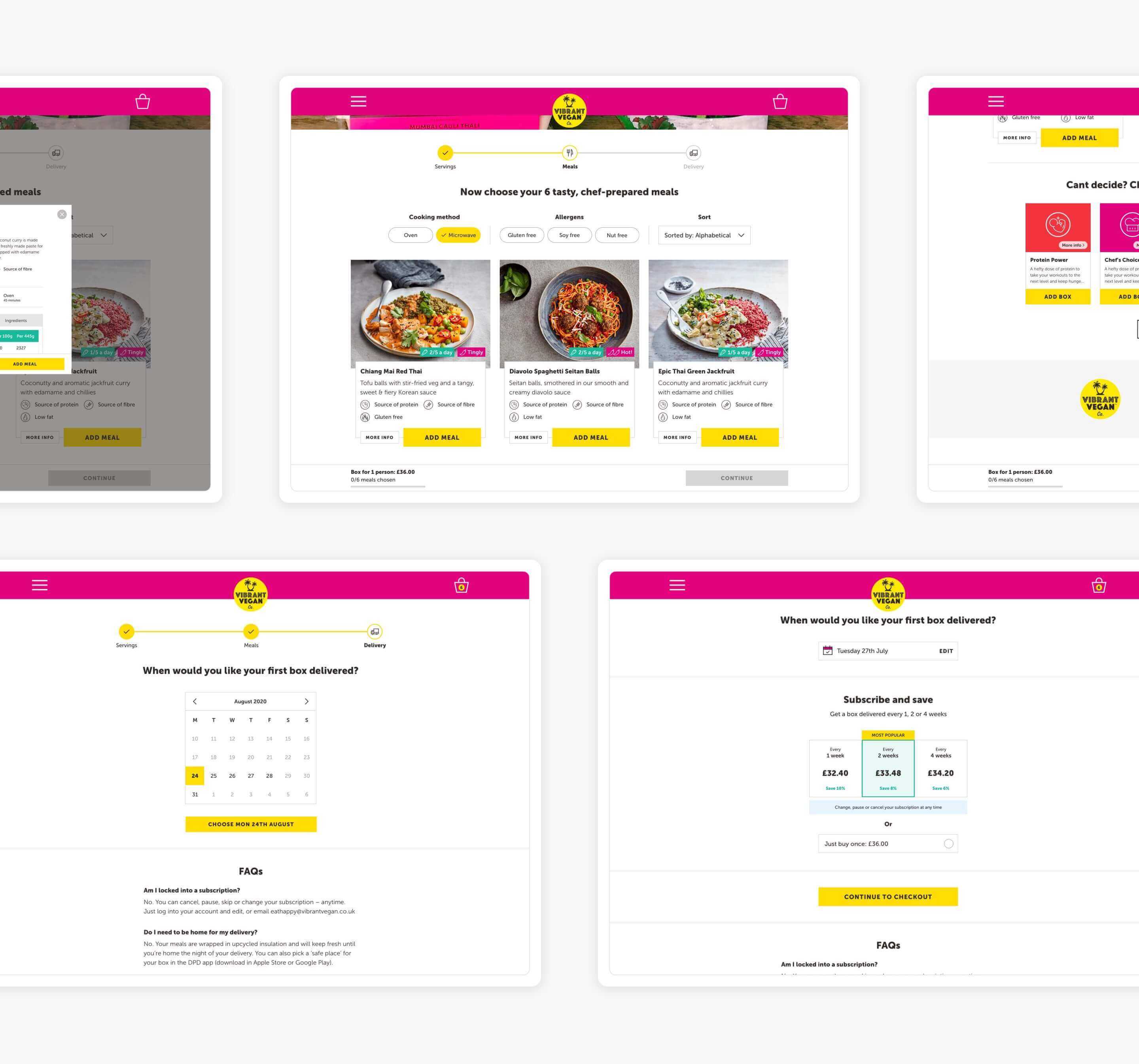
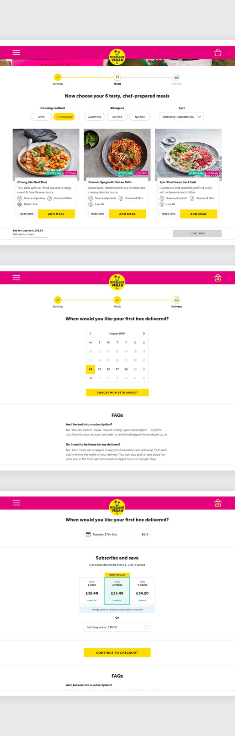
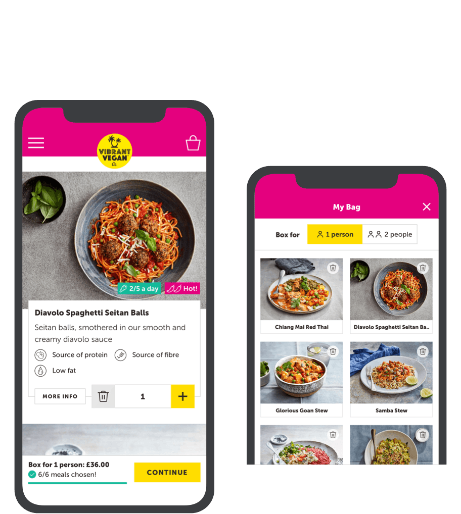
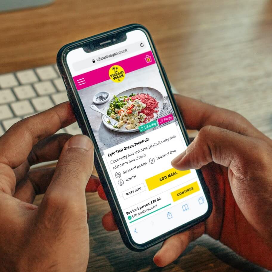
One of the key problems discovered during the research was confusion over the proposition. What exactly am I getting? How often? And when? The final design looks to solve these problems by providing a more guided experience.
A sticky component at the bottom of the screen provides key information for the user at all times, whilst the inclusion of a progress bar provides feedback on what to expect and when.
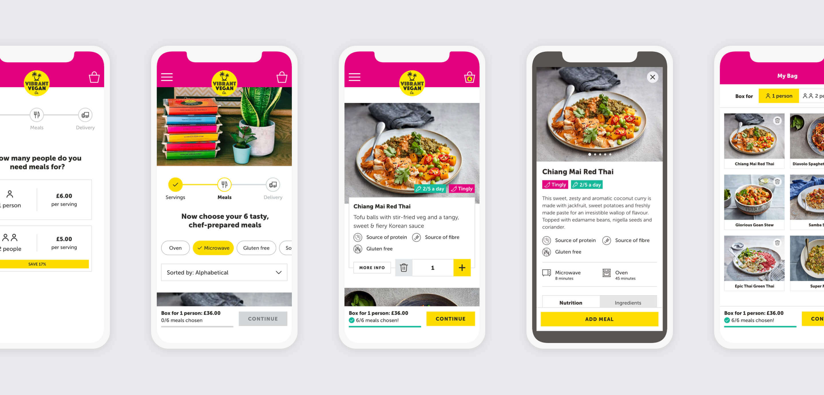
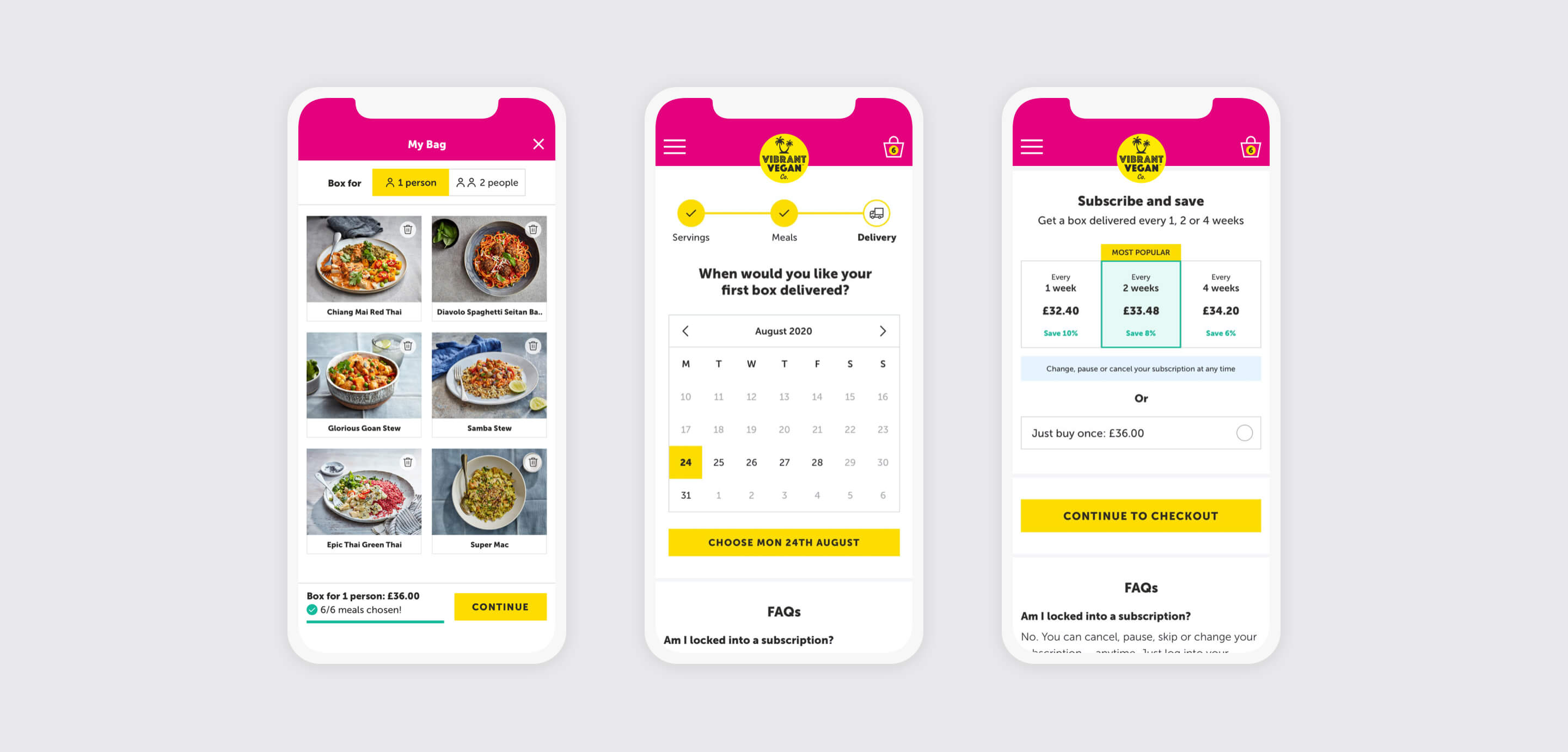
Putting the users in control
At the delivery stage, a calendar picker is used to enable customers to pick their first delivery date, followed by a simple set of options to determine how frequently they would like to receive a box.
Beautiful on all devices
Although we decided early on to use a mobile-first approach, 35% of Vibrant Vegan’s users are not mobile-based. This made it imperative that the designs scaled well across all devices, and that the experience was slick whether on desktop, tablet or mobile.